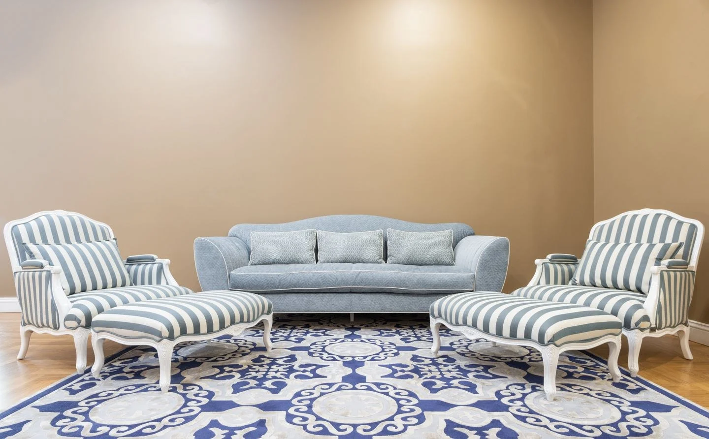
A gray sofa does not require gray walls, and a warm oak floor does not rule out blue-gray fabric. Warm and cool neutrals can share a room when the difference is intentional. Trouble usually begins when several almost-matching colors compete without a clear dominant surface.
Lay out the largest fixed elements first: flooring, upholstered furniture, cabinetry, and any substantial stone. These occupy more visual space than a collection of accessories. Decide which temperature already dominates. A honey-colored floor may provide enough warmth that the walls can remain cooler; a room full of steel-gray surfaces may benefit from warmer fabric at eye level.
Find a connecting material
A textile containing both temperatures can make the relationship easier to read. Imagine a cool gray sofa on an oak floor with an ivory-and-charcoal rug. The rug shares the sofa's gray family while its lighter field softens the transition to wood. It connects the materials without pretending that they match.
Alternatively, use a stone or artwork with several quiet tones. The connecting piece does not need to be large or expensive, but it should be visible from the main seating position. A tiny object hidden on a shelf cannot explain a room-wide palette.
Avoid distributing every color equally. Let the floor or walls establish the background, the sofa carry a second tone, and smaller objects add contrast. Equal areas of cool gray and warm beige can feel divided down the middle. Unequal proportions give the eye a clearer hierarchy.
Separate color from texture
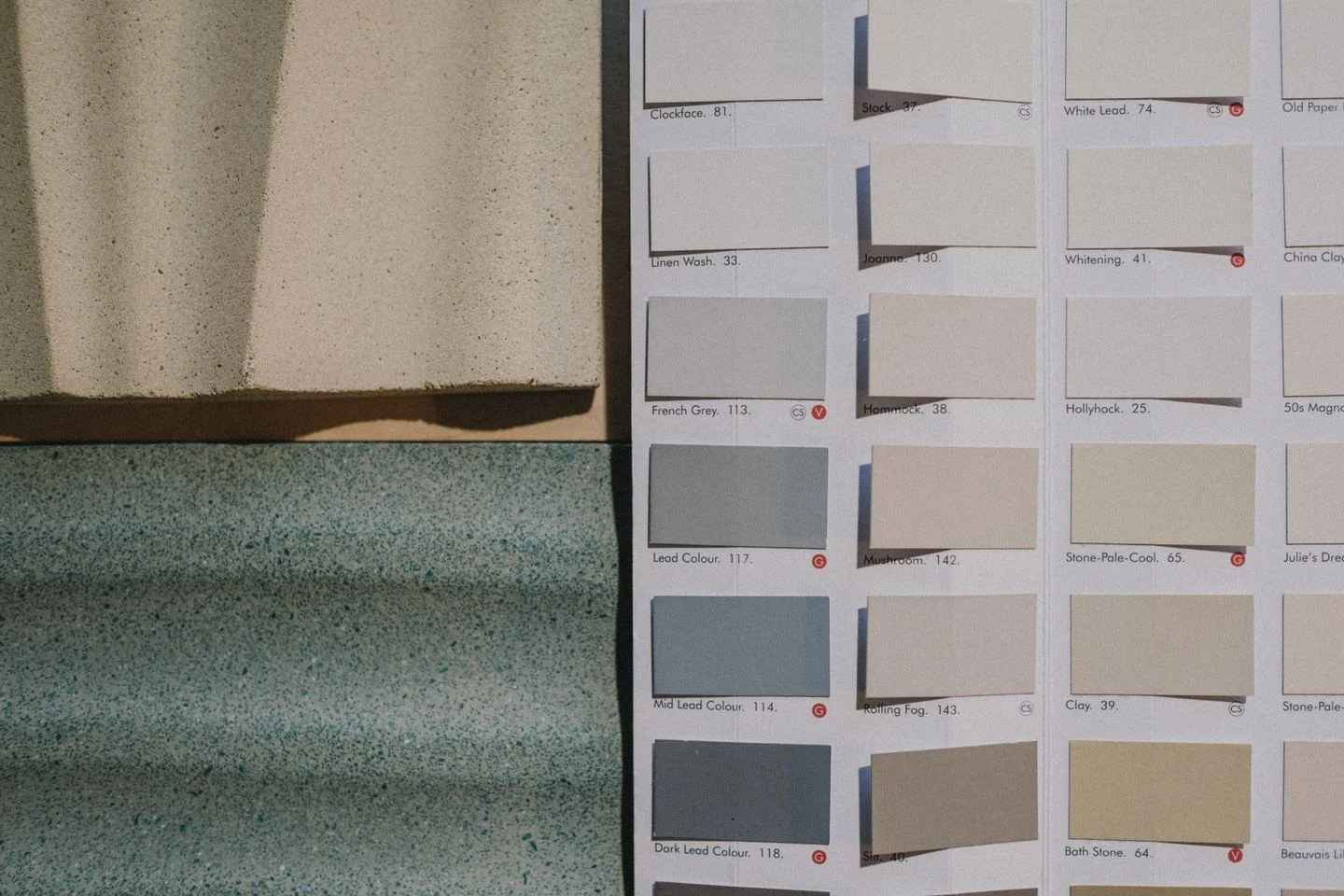
A cream boucle chair and cream painted cabinet share a hue but behave differently in light. Texture introduces shadows; gloss introduces highlights. Those variations can help a neutral room feel layered even when the number of colors remains small. Conversely, several smooth gray surfaces may look flatter together than their sample cards suggest.
Benjamin Moore's warm-and-cool guide notes that neutral colors also have undertones. Compare actual samples together rather than classifying everything labeled gray as cool or everything labeled beige as warm. A pinkish taupe and a yellowish ivory may be the difficult pair, even though both seem warm in isolation.
At night, view the arrangement under the lamps you normally use. If one fabric suddenly looks blue and another orange, reconsider either the combination or inconsistent lamp color temperatures. Do not repaint an entire room to solve a mismatch caused by a single unusually cool bulb.
The goal is a room with a coherent balance, not a temperature test with one winning side. Keep the contrasts you can describe and enjoy, and remove the near matches that continually look accidental.