A patterned rug already contains a set of color relationships. That makes it a useful starting point for a room, provided you do not turn every color in the pattern into an equal-sized decorating assignment. The most visible rug color and the most interesting rug color may have very different jobs.
Spread the rug out in the room before making decisions from a folded corner or product photograph. Step back to the doorway. Which color reads first at that distance? In a busy pattern, the combined effect may be quieter than any one strand viewed close up. That overall impression is the starting background for the room.
Give the colors different amounts of space
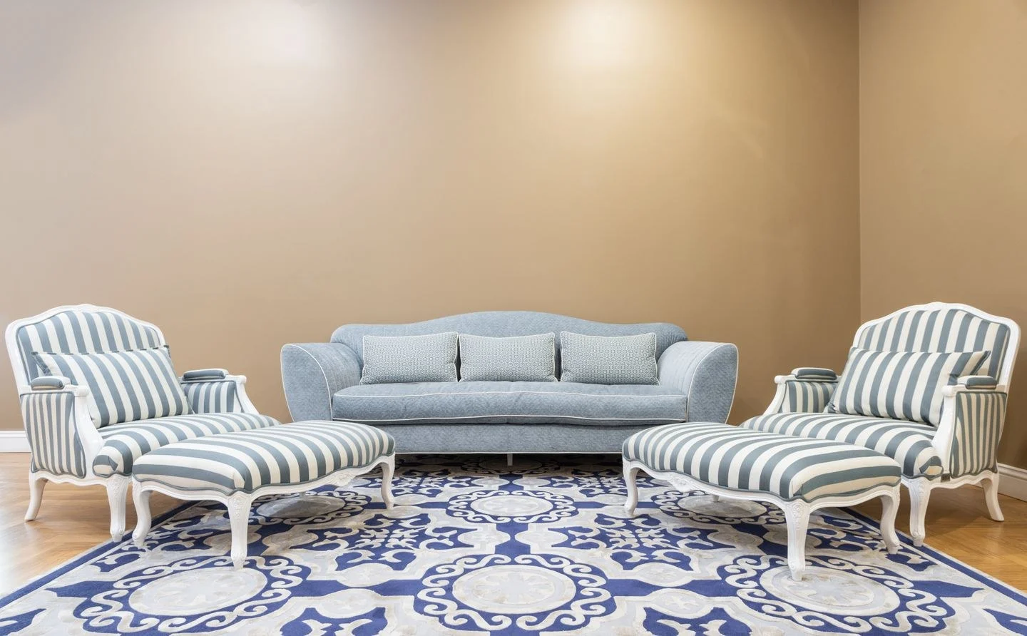
For a rug with a pale ground, faded blue motifs, and small rust details, consider pale walls, a solid blue-gray chair, and one rust-colored pillow. The colors return at different scales, allowing the rug to remain the most complex surface. Matching the sofa, curtains, and every cushion to the rust detail would reverse the balance and make the rug feel like an afterthought.
You can also leave one rug color entirely on the floor. Repetition is a design option, not a requirement for every thread. A little green in a border may be enough green for the room, especially when a window already frames a leafy view.
Test the wall as a neighbor
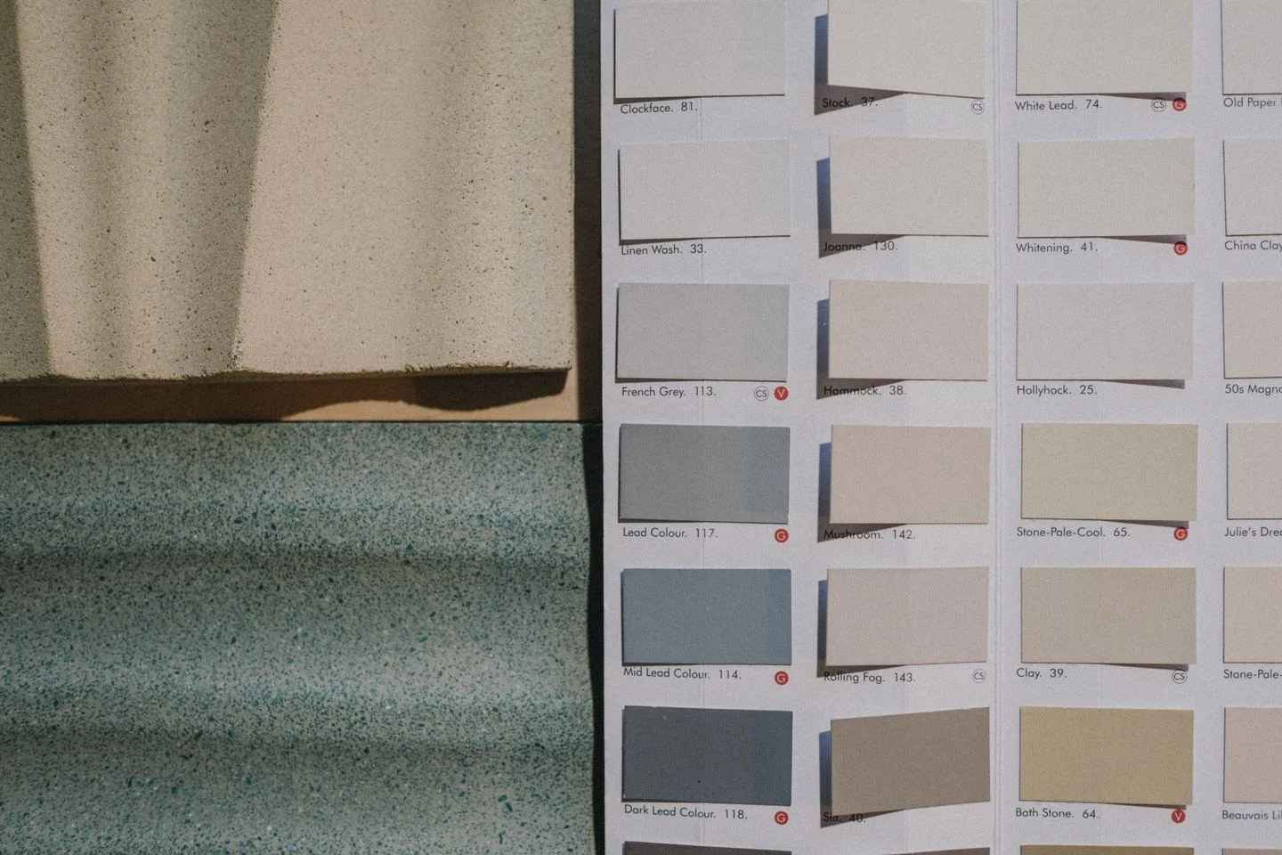
Place paint samples above the rug rather than directly on it. This recreates the vertical relationship between the wall and floor and avoids evaluating everything under the same pool of light. Look from both standing and seated positions, since a sofa may hide much of the rug during everyday use.
Do not insist on an exact paint match. A slightly quieter wall color can let the textile retain its depth. If the rug is saturated, a related neutral often provides more breathing room than another saturated surface. If the rug is muted, the walls can carry a stronger color without producing the same degree of competition.
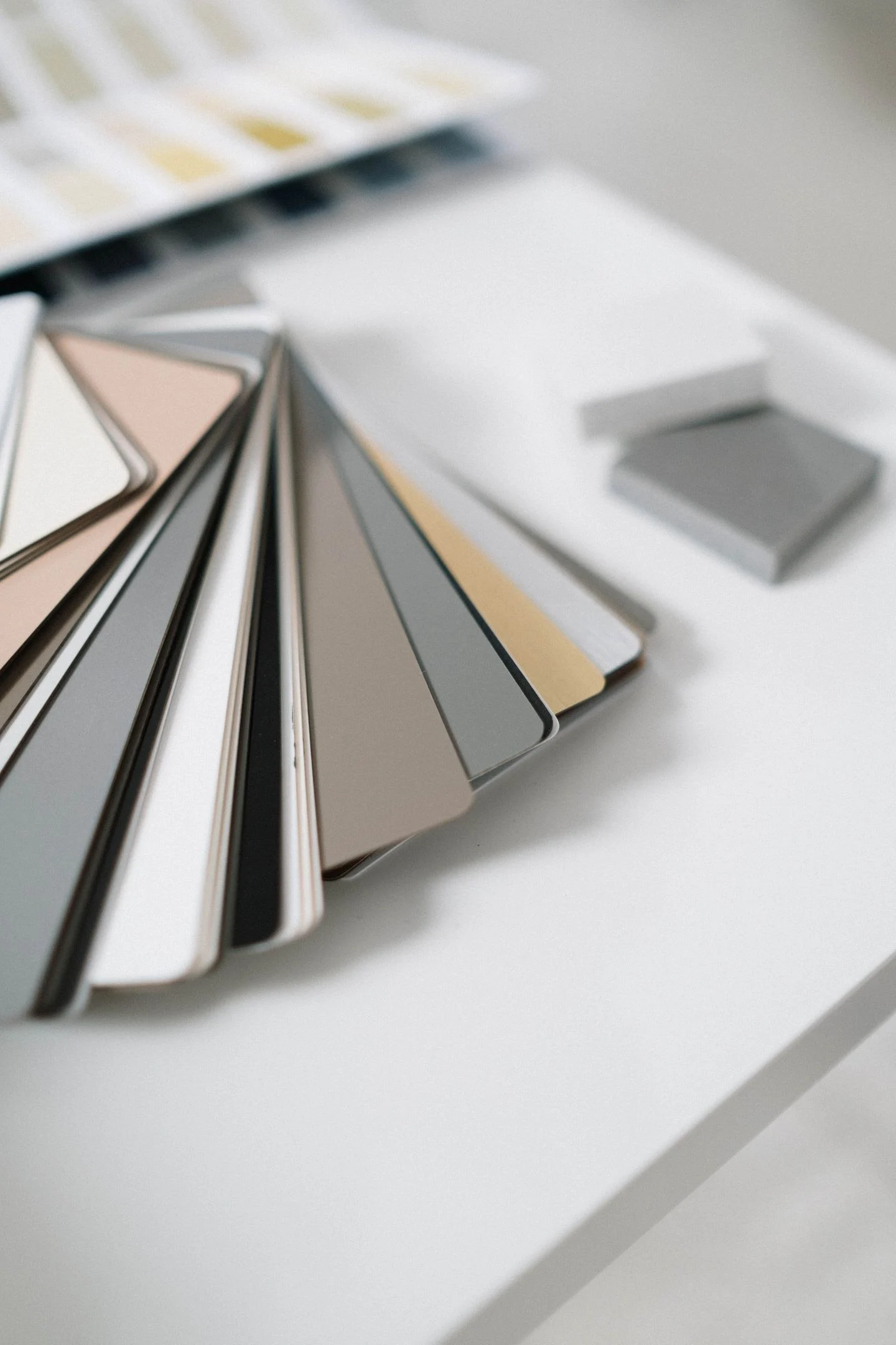
Add wood and metal samples to the group before buying large furniture. Brown wood is part of the palette even when it is described as a material rather than a color. A red-brown table can amplify the rust accents; a pale ash finish can make the blue feel more prominent.
Keep the final palette small enough to remember: a background, one substantial companion color, and a restrained accent. The rug can hold the remaining variations. This approach gives future purchases a clear direction while preserving the complexity that made the rug appealing in the first place.