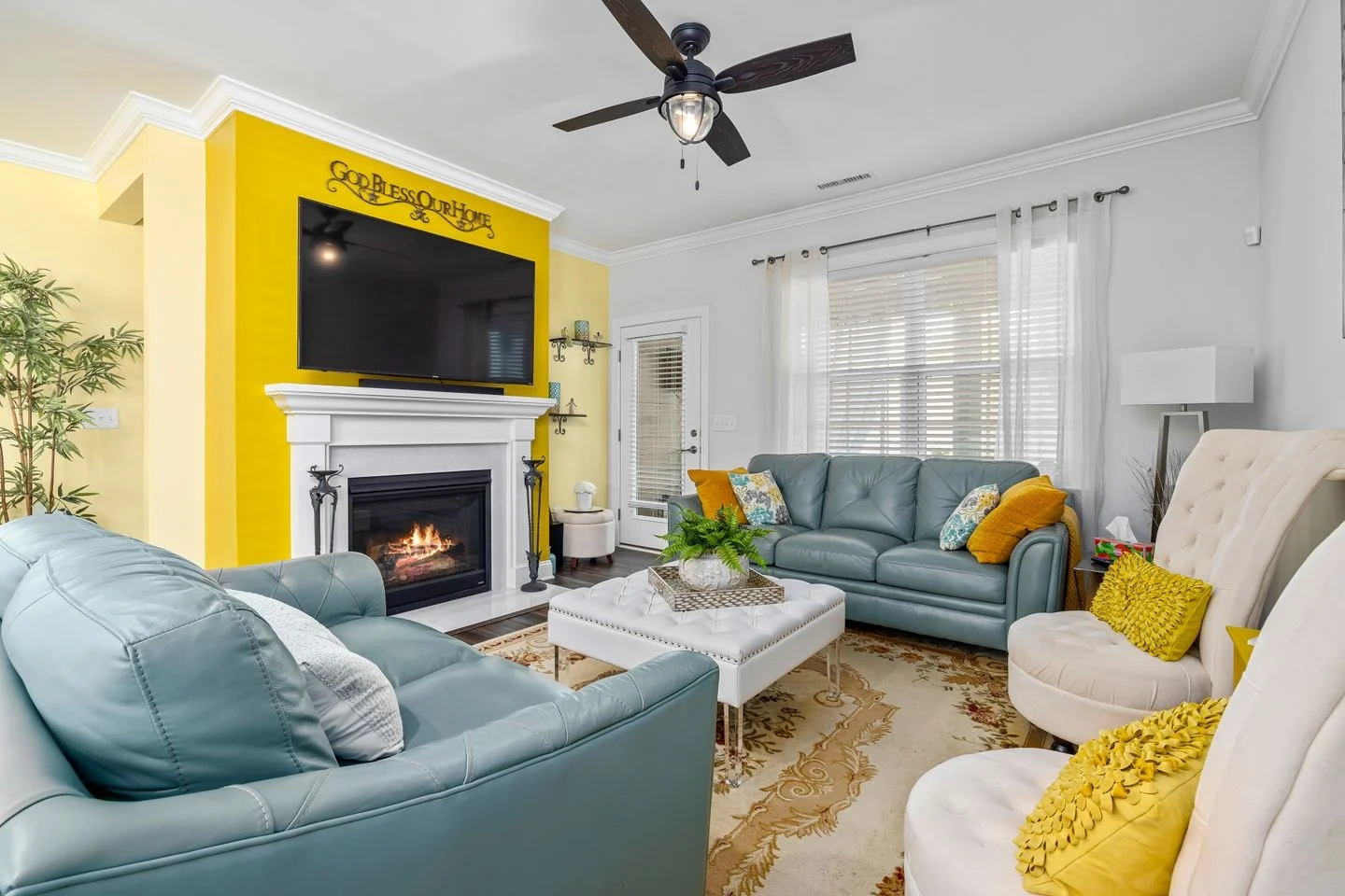
Color repetition is useful because it lets the eye recognize a relationship across a room. It stops being useful when every surface carries the same accent simply to prove that the palette is coordinated. A blue chair, blue vase, blue throw, blue frame, and blue lamp can become a list rather than a room.
Choose one main appearance of the color. This might be a substantial chair, a curtain, or an area within a rug. Give that piece enough visual space to establish the color before deciding where it should return.
Change the scale of the repeat
A small blue detail in a painting can relate to a blue sofa without competing with it. The second appearance may be lighter, grayer, or woven into a pattern. Exact matching is less important than a recognizable family.
Place the repeat where it connects parts of the room. A color on the far wall can link back to the seating group. An object hidden behind a door contributes little to the main view. Walk through the room to judge the relationship from more than one position.
Material variation helps keep the repetition natural. Painted wood, cloth, and glazed ceramic produce different highlights and shadows. Using the same color across different materials can feel more layered than buying several accessories with an identical finish.
Let some areas remain unrelated
A quiet corner does not need the accent color merely because the other corners have it. Leave room for plain wood, books, and objects chosen for their use. Those intervals prevent the palette from feeling imposed on everything.
If a room looks overly coordinated, remove the smallest repeated items first. Often the large piece and one secondary connection are enough. If it looks disconnected, try moving an existing accent into a clearer sightline before purchasing another.
There is no required number of repetitions. The amount depends on the strength of the color, the room's size, and the objects carrying it. A vivid red needs less area to register than a muted gray-green. Use the room's actual view as the test: the color should create a connection you can see, without becoming the reason every object was selected.