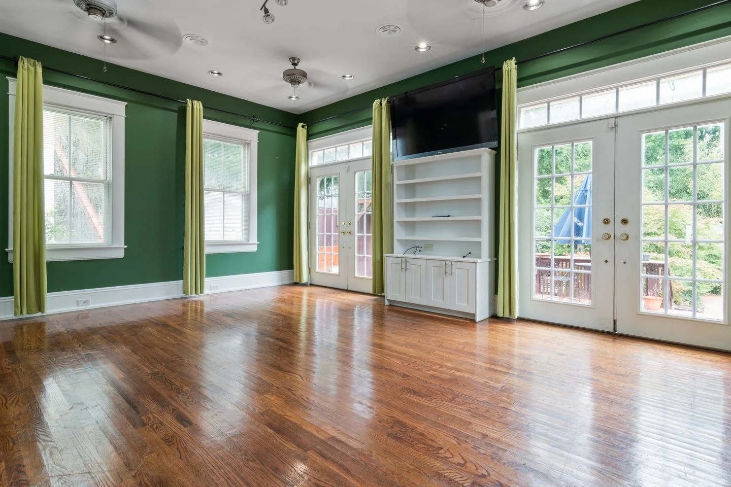
Muted green changes character beside different woods. With golden oak it can feel earthy and bright; with walnut it may look deeper and more subdued. The word green covers enough variation that a sample described as sage is not a reliable match for every brown surface.
Begin with the wood you are keeping. Look beyond its overall lightness to the red, orange, yellow, or gray notes in the finish. A large floor and a small side table need different attention: the floor sets a broad background, while the table can act as a darker punctuation mark.
Compare two directions of green
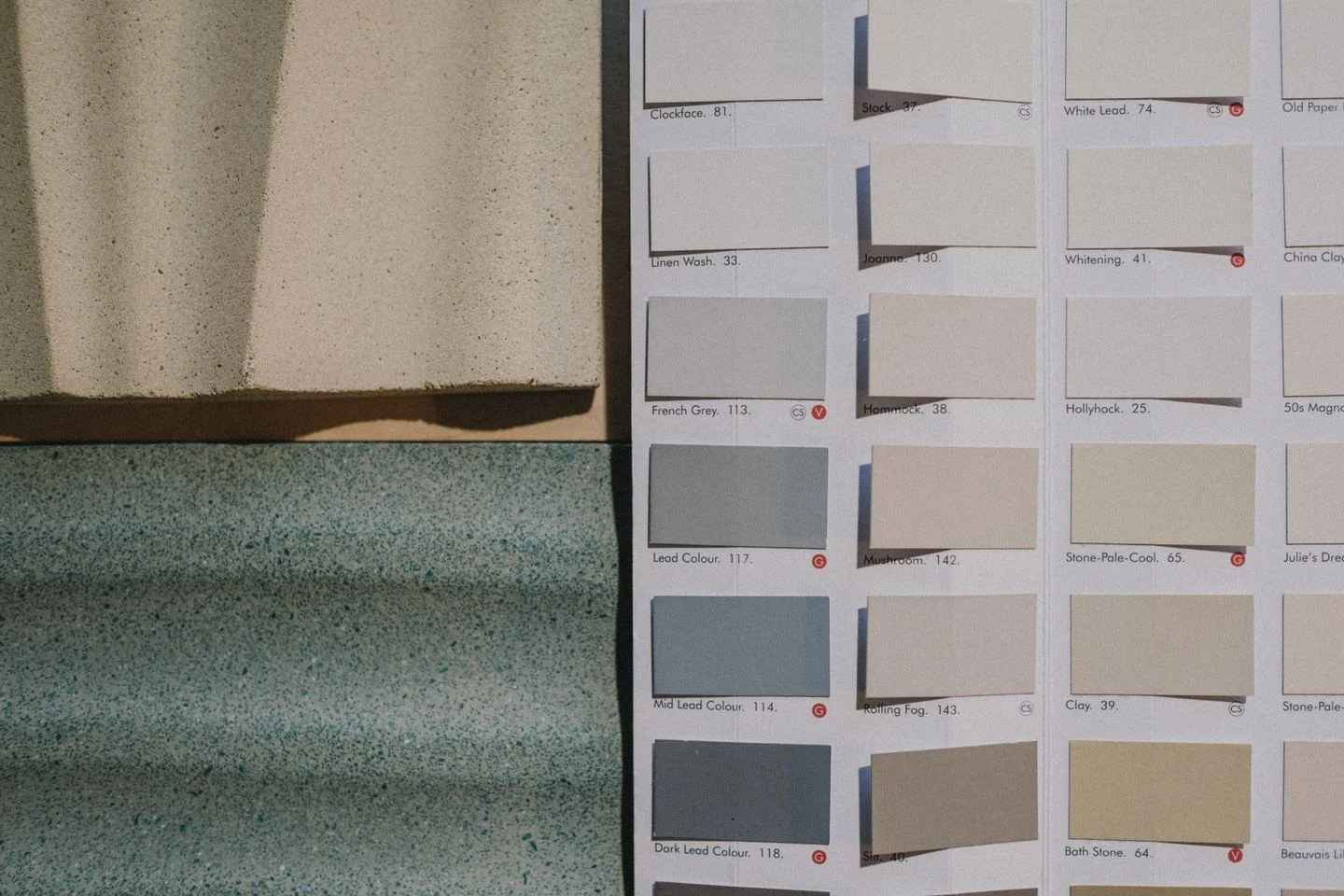
Put a grayer green and a yellower green beside the wood. You do not need a large assortment to see the difference. One may make a honey oak floor appear more orange, while the other creates a softer transition. The response is visual and specific to the room; neither result is automatically wrong.
For a pale wood bedroom, a subdued green wall can sit comfortably with ivory bedding and a darker bedside lamp. The lamp supplies a point of contrast so that the room does not dissolve into similarly light surfaces. With a walnut dining table, green upholstery can be the smaller color area, leaving the walls quieter.
Keep the supporting colors deliberate
Cream, oatmeal, charcoal, and soft pink all offer different partners. Cream connects easily with warm wood but should be compared with existing white trim. Charcoal sharpens the outline. Pink introduces a gentle contrasting hue and works best when its strength is considered alongside the green rather than chosen independently.
Benjamin Moore's green color guidance includes warm neutrals and soft pink among possible companions. Use that as a direction to explore, not a complete scheme to copy. The right textile may carry a grayer pink or a browner neutral than the paint example you first admired.
If several wood finishes are present, repeat one of them in a second location before adding another. A walnut frame across from a walnut cabinet makes the darker wood feel intentional. You need not replace a useful oak piece simply because it does not match.
Finally, view the green after sunset. Lamps, shadows, and the texture of nearby upholstery can change how strongly it reads. If the room feels too dark, first add a lighter textile or improve the useful lighting rather than assuming the entire color choice has failed. A muted green palette usually benefits from a clear light surface and one definite dark detail.