Two adjoining rooms can have different colors and still feel connected. The connection happens where they are seen together: through a doorway, across an open plan, or along a hallway. Start with those views instead of approving each room as an isolated photograph.
Stand at the main entrance and record which surfaces appear at once. You may see a living room sofa, a dining room wall, and the edge of a kitchen cabinet. Those three elements need a relationship even if they belong to different decorating categories. A bedroom hidden behind a closed door has more freedom.
Choose what repeats
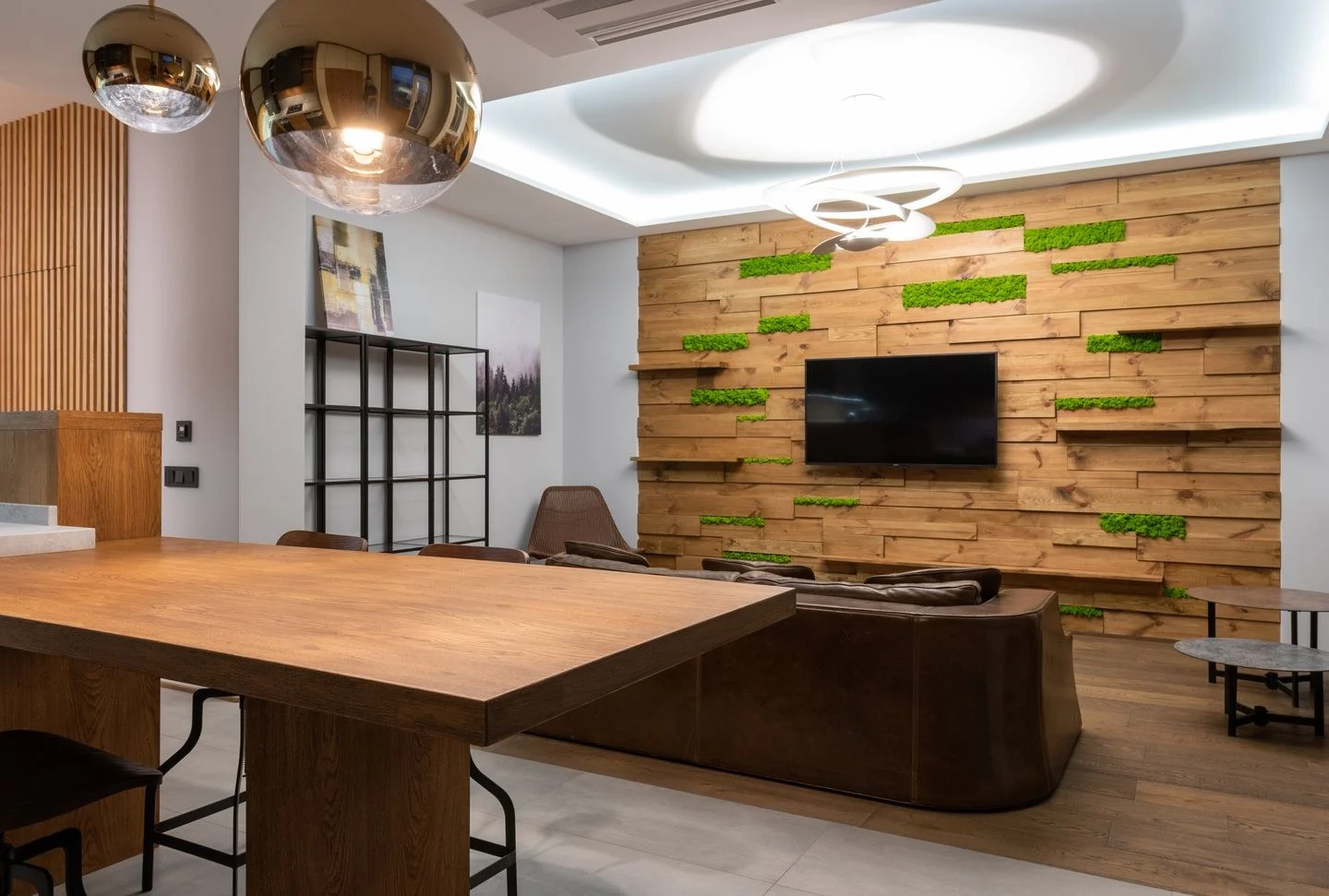
One repeated material can be enough. The same wood tone in a living room table and dining room chairs may connect two different wall colors. A cream curtain in one room and cream upholstery in another can perform a similar role. Repeating everything would make the rooms feel less distinct, not necessarily more coherent.
Trim can provide a continuous line, especially in older homes with connected door casings. If the trim remains the same color, test each wall paint beside it. A white that appears quiet against one wall can look sharply yellow against another. Compare the actual intersections before committing.
Give neighboring colors different jobs
A pale green living room and a deeper green dining room can create continuity through the same family. Another option is a blue room beside a warm neutral room, connected by a rug or artwork that includes both. The relationship matters more than exact matching.
In an open plan, avoid changing paint at a point with no architectural boundary unless the division is an intentional graphic feature. A sofa edge or rug is not always a convincing place for a wall color to stop. Furniture can define zones while the wall color remains continuous.
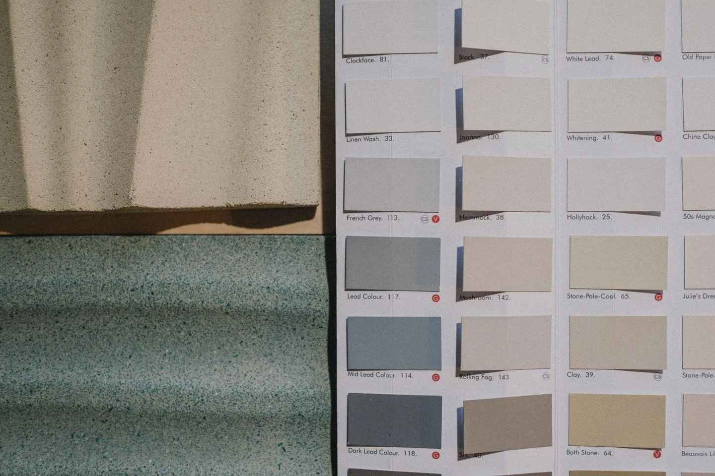
Carry samples between the rooms at the same time of day. Different window orientations may make identical paint appear different anyway. Benjamin Moore's sampling guidance encourages viewing colors in multiple positions and lighting conditions; adjoining spaces make that especially relevant.
Finally, examine the sequence at night with the usual lamps switched on. A very cool light in one room can make a related palette appear disconnected from a warmer neighboring room. Resolve obvious lighting inconsistencies before replacing a color that works in daylight. Continuity is the combined effect of color, material, and illumination, not simply the number of paint cans used.