A tonal room can contain considerable variety without changing color families. The difference between chalk, oatmeal, camel, and deep brown is enough to organize a space when the materials and proportions are chosen deliberately. What makes a tonal room feel unfinished is often a lack of contrast, not a lack of color.
Think of the room in a black-and-white photograph. Would the sofa disappear into the rug? Would the cabinet merge with the wall? You do not need to photograph everything, but the question helps separate lightness from hue. Several nearly identical midtones can flatten a room even when their textures differ.
Establish a light field and a darker anchor
The light field might be the walls, curtains, or a substantial rug. The darker anchor could be a wood table, upholstered chair, or group of frames. Between them, use the main furniture to carry the middle values. This gives the eye a readable sequence rather than a collection of equally pale objects.
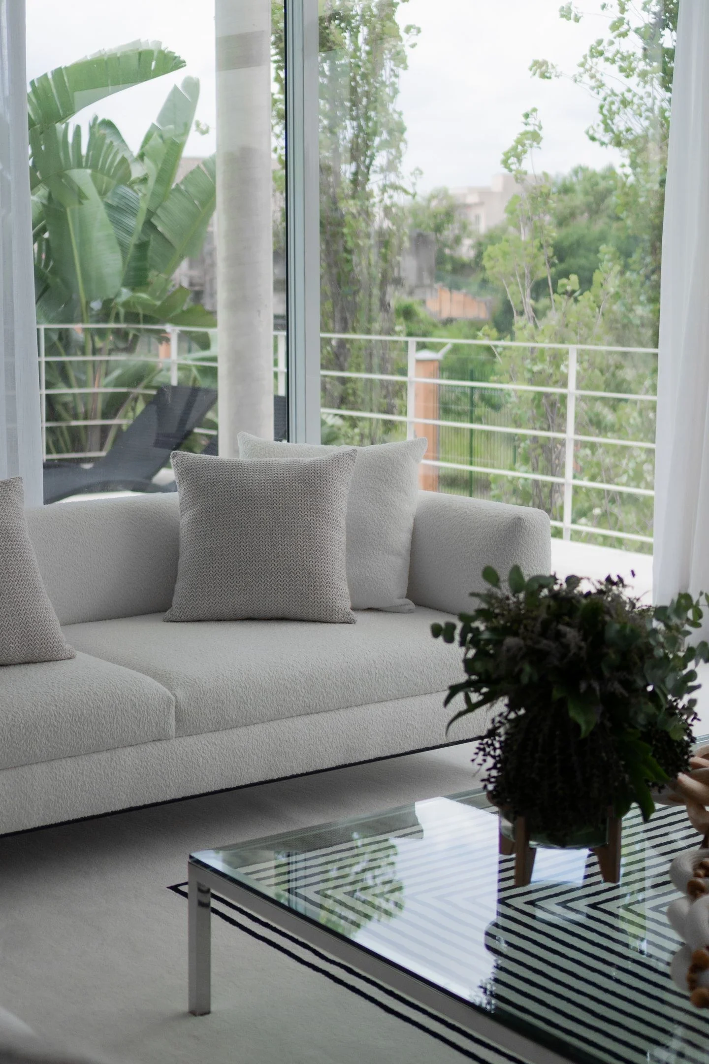
For a cream living room, imagine warm white walls, oatmeal seating, a slightly darker woven rug, and a walnut table. A dark lamp base can repeat the table's depth at another height. The room remains tonal because the colors belong together, but the individual pieces retain their shapes.
Texture should have a purpose
Woven fabric, smooth wood, glazed ceramic, and brushed metal reflect light differently. Place contrasting textures where they meet: a smooth table beside a nubby chair, for example. If all the texture is confined to small accessories across the room, it may not influence the main view.
Do not assume that more texture always means more interest. Too many coarse surfaces can feel busy, particularly in similar colors. Introduce a smooth interval, such as a plain wall or simple cabinet front, so the rougher materials remain noticeable.
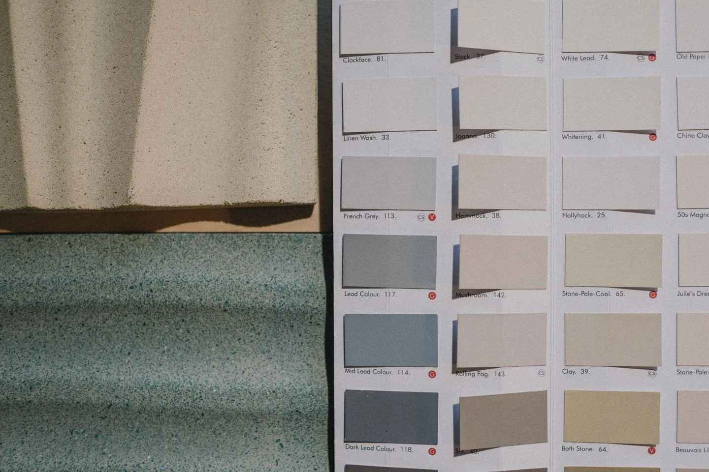
Check undertones in person. Two creams can disagree more sharply than a cream and a definite brown. Benjamin Moore's guidance on warm and cool neutrals is useful here: compare neighboring samples instead of judging each alone. The room's light may reveal a pink or green note that was difficult to see in a store.
A tonal scheme also benefits from editing outlines. One sculptural chair may provide enough variation in form; another cluster of cushions may not add much. Before buying a colorful accessory to solve the room, try moving a darker object into the main sightline or removing a redundant pale one. The missing ingredient may be definition rather than a new hue.