Pink can be a background color rather than a decorative theme. A dusty pink wall with walnut furniture and an oatmeal rug behaves differently from bright pink accessories against white. To make the palette feel grounded, consider the amount of pink and the weight of the materials around it.
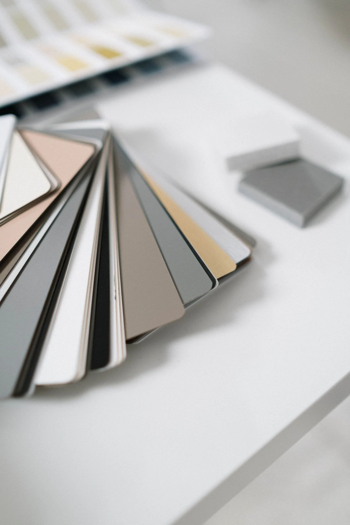
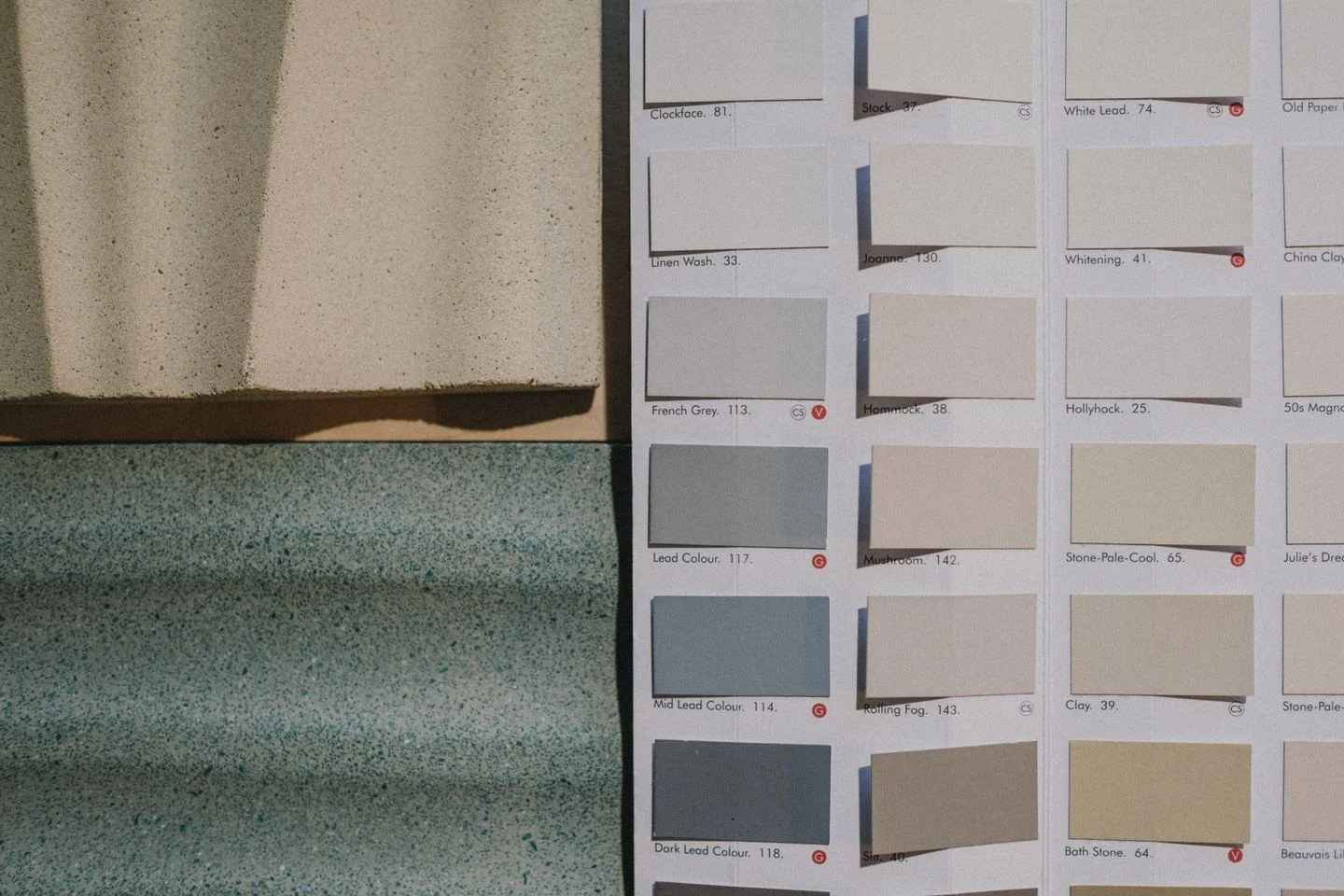
Start with a pink that suits the existing floor. Some pinks lean toward peach, others toward mauve. Set samples beside the wood or tile instead of judging them against a plain white desk. A peachier pink may amplify orange in oak; a grayer rose may look cooler beside it. Choose the relationship you prefer rather than searching for a pink that is universally neutral.
Add a clear darker value
A dark table, charcoal lamp, or deep brown frame can give the room definition. It need not occupy much space. The important point is that the pink has something more substantial beside it than another pale pastel.
Wood is especially useful because it contributes pattern as well as color. A simple walnut cabinet can balance a broad pink wall without adding another motif. If the wood grain is active, keep nearby textiles quieter so the combination remains readable.
Cream and oatmeal can soften transitions, but compare them with existing white trim. A very yellow cream may change the pink's appearance. Use the same care with brass: its warmth can be welcome, yet a room already full of warm finishes may need less of it than expected.
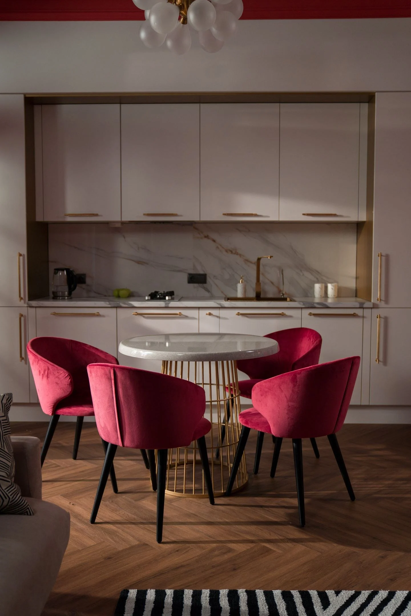
For a smaller intervention, try pink upholstery against neutral walls. A single chair allows you to judge the color at a meaningful scale without repainting. Repeat the pink only if the room needs the connection; a small detail in art may be enough.
Avoid giving every pink object the same finish. Matte paint, woven fabric, and glazed ceramic create different highlights and shadows, even within one family. A limited palette becomes more interesting through these differences. The result can remain unmistakably pink while the furniture, shape, and contrast keep it from becoming a single-note room.