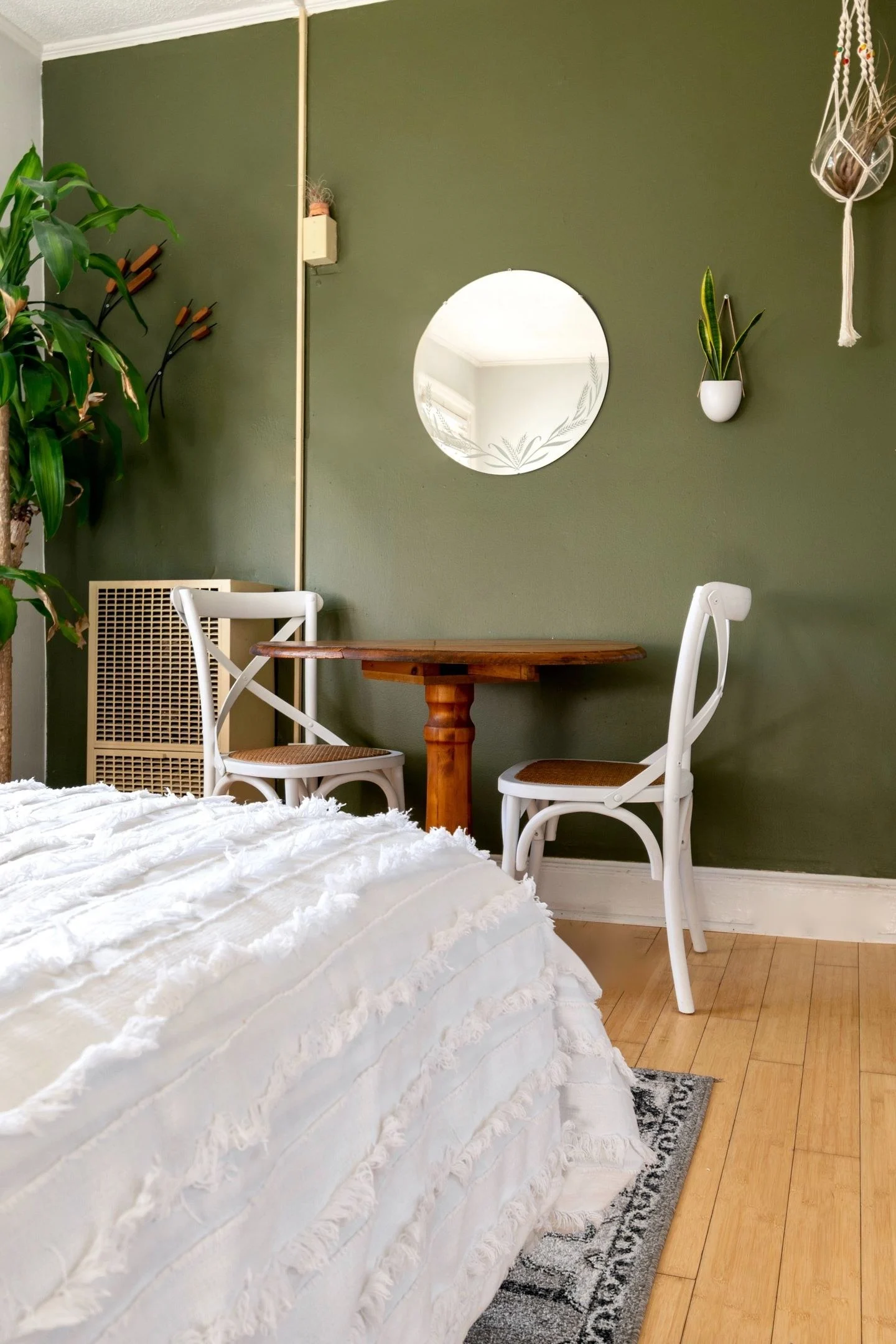
Green and cream can make a gentle palette, but the room may need a darker value to keep its shapes distinct. A dark accent is not an instruction to outline everything in black. It is a way to give the eye a few places to settle.
Choose which surface carries green. Green walls with cream seating create a different balance from cream walls and a green sofa. In the first arrangement, the color surrounds the room; in the second, it has a defined furniture shape. Keep that distinction in mind when deciding where a darker piece belongs.
Choose a dark material that already fits
Walnut, charcoal fabric, deep bronze, or a dark green can all provide depth. A walnut table may suit a room with warm flooring better than a sharply black lacquered one. Charcoal can give a cooler edge. Deep green keeps the palette closely related while still creating contrast.
Try the dark accent at two heights. A table near the floor and a picture frame on the wall can balance each other without matching exactly. If the room already contains a black television or fireplace opening, include it in this assessment before adding more dark objects.
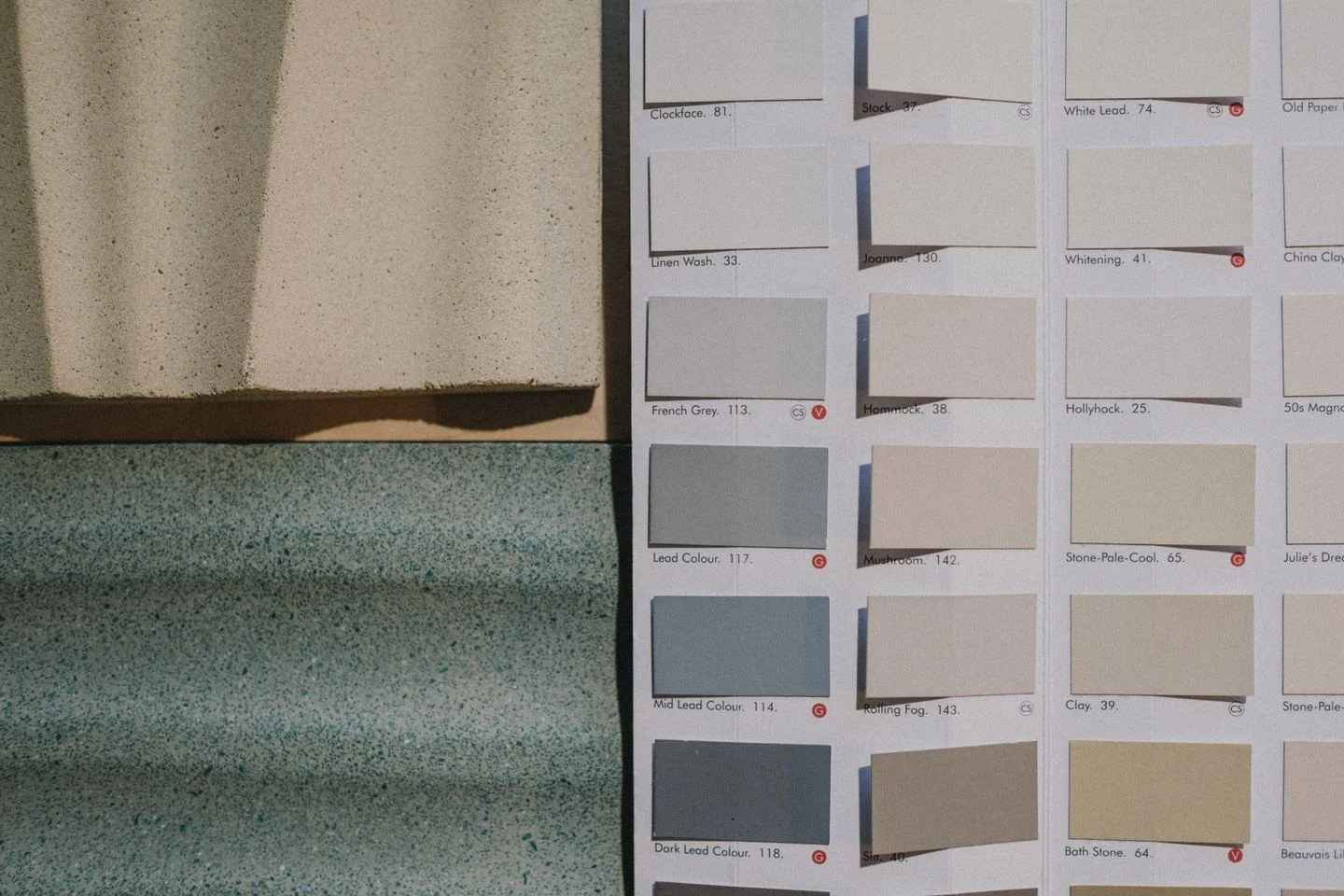
The cream needs attention, too. Compare it with the green and any white trim. Some creams are noticeably yellow, while others are closer to a soft neutral. A sample should be viewed in the room, particularly under the lamps used in the evening.
Keep the textile layer varied
A plain green sofa, cream woven curtain, and rug containing both colors can create enough connection. Add texture through one or two surfaces rather than filling the seating with many differently patterned pillows. The darker detail can remain in wood or metal so the textiles do not all have to carry contrast.
If the finished arrangement feels heavy, reduce the area of the dark accent rather than removing contrast altogether. A slim-legged table may work better than a solid dark cabinet in the same location. If it feels washed out, move a dark object into the main sightline before buying another. The palette becomes convincing through placement and proportion, not a fixed number of green, cream, and black items.