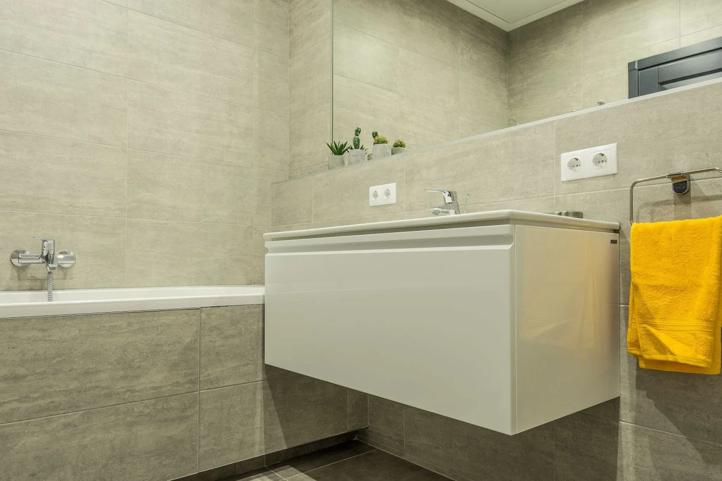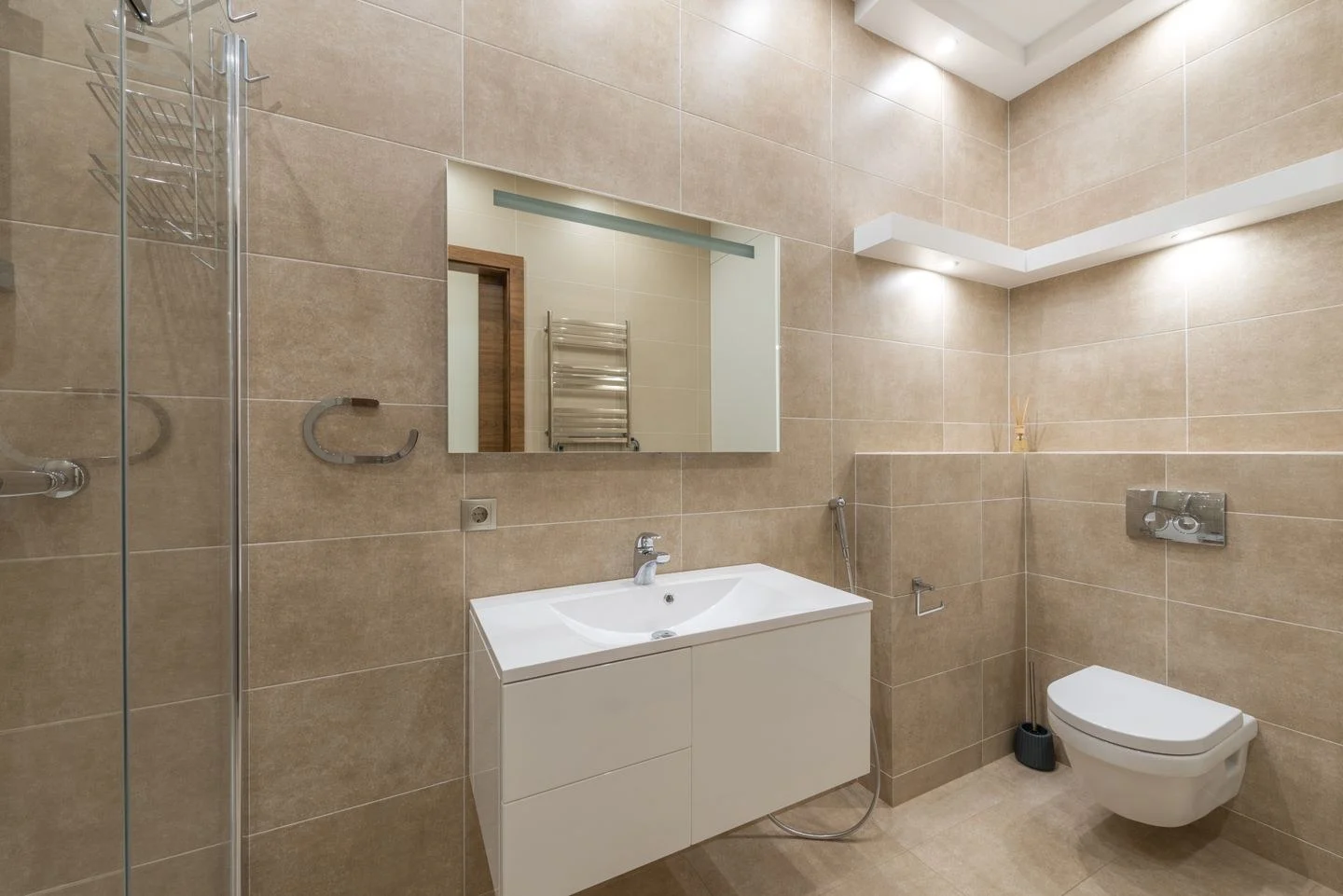
Beige bathroom tile is rarely just beige. It may lean toward pink, yellow, gray, or a mixture that changes with the light. A refresh becomes easier when the tile is treated as the starting material rather than an inconvenient background to be hidden.
First, compare the tile with a plain white sheet of paper and with the sink or bathtub. The fixtures may already be a warmer white than the paper. Look at several tiles, because a patterned surface can contain more than one undertone. Note which color occupies the largest area rather than concentrating on a small fleck.
Try two directions before choosing paint
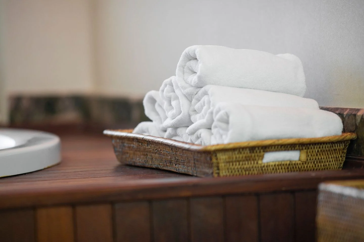
One direction is close in value: cream, pale oatmeal, or a soft warm neutral that keeps the walls and tile visually connected. This can suit a small room with many tiled surfaces. It still needs some definition, perhaps through a wood cabinet, a darker mirror frame, or towels with a fine stripe.
A second direction uses a clear contrast. Muted blue-green, a dusty terracotta accent, or a deeper brown can make beige feel deliberate. Begin with a towel or a large sheet of colored paper so the experiment is reversible. A color that looks attractive in isolation may pull an unwanted pink or yellow note from the tile.
Imagine a bathroom with pale tan floor tile, a cream basin, and a medium wood vanity. Cream walls with dark blue towels would produce a quieter permanent shell and a changeable accent. Blue-green walls with plain cream textiles would give the color a larger role. These are different compositions, even if the same colors appear in both.
Check samples where the surfaces meet
Paint samples belong beside the tile, beside the vanity, and near the mirror, rather than on an unrelated wall outside the bathroom. Follow the sample product's instructions and assess the color under the lighting used in the room. Benjamin Moore's sampling guidance is useful for comparing color in the space before committing.
Do not judge only in bright daytime conditions if most bathroom use happens before sunrise or after dark. A warm bulb may bring out yellow in the tile; a cooler source may emphasize gray. Evaluate the whole scheme with the lights you intend to keep.
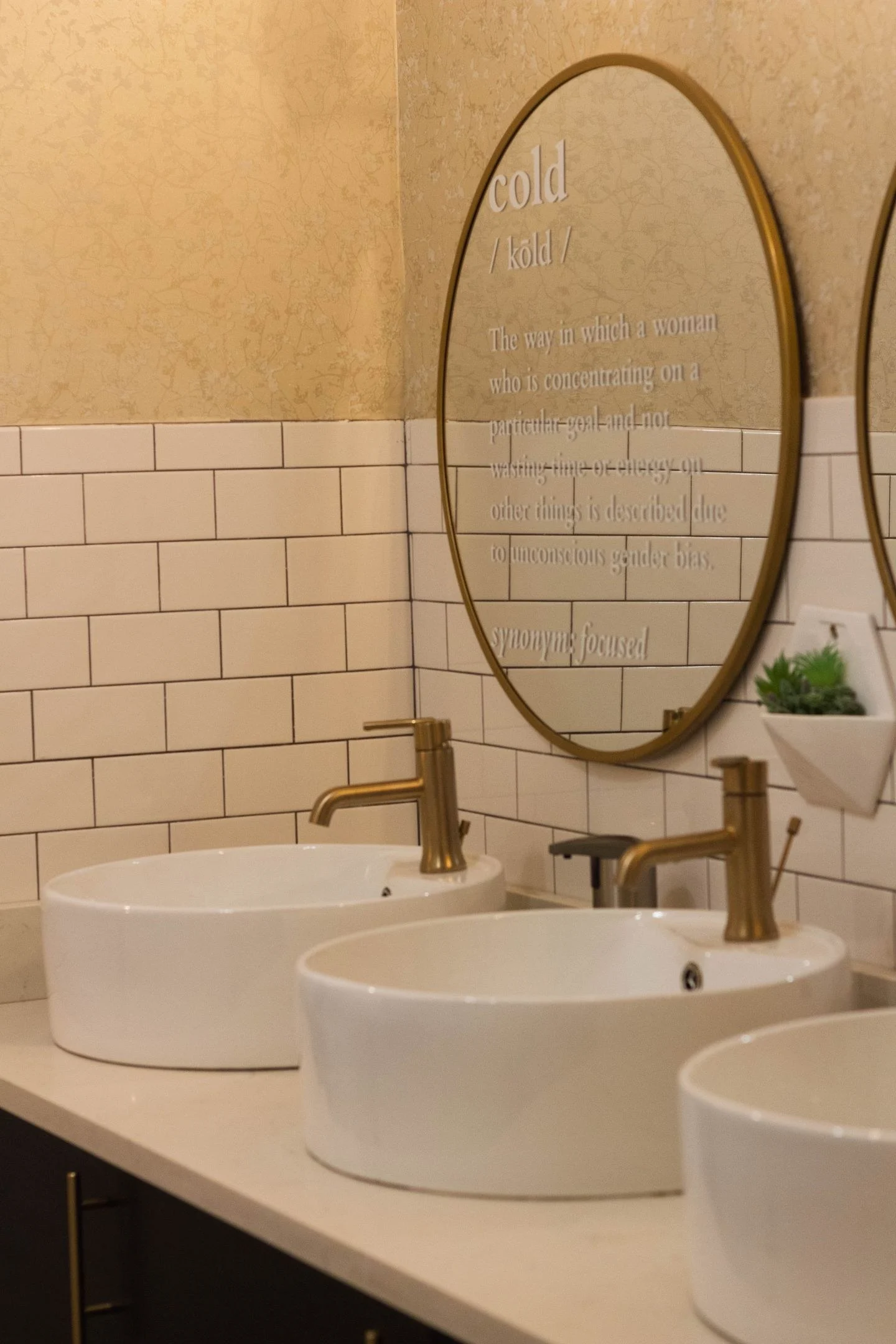
The grout also contributes to the palette. Dark joints create a grid, while pale joints produce a broader field of color. Choose patterns in towels and curtains with that existing rhythm in mind. A small busy textile print can compete with strong grout lines even when the colors coordinate.
Keep the first purchase modest: one hand towel, one sample, or one accessory you need anyway. Once that relationship works, extend it to the larger surfaces. The tile does not need to disappear for the room to feel newly considered.